Stefan Delamaire

UX Designer

Stefan Delamaire

UX Designer

Stefan Delamaire

UX Designer

Stefan Delamaire

UX Designer

Bell & Ross

UX/UI Mobile App - Interaction Design - IOT Beacon

Bell & Ross is a renowned Swiss luxury watch brand, celebrated for its precision and elegance, with designs crafted specifically for aviation professionals, pilots, and aviation enthusiasts. Known for its heritage and expertise in the art of Swiss horology, the brand has established itself as a prestigious name in the luxury watch market. This project aimed to enhance the in-store experience for Bell & Ross customers by creating an interactive mobile application designed to function seamlessly within the brand’s flagship stores in Paris. The objective was to provide a sophisticated, high-tech experience that reflects the brand’s luxury identity while enriching the customer journey through intuitive navigation, guided information, and personalized insights.

<br>

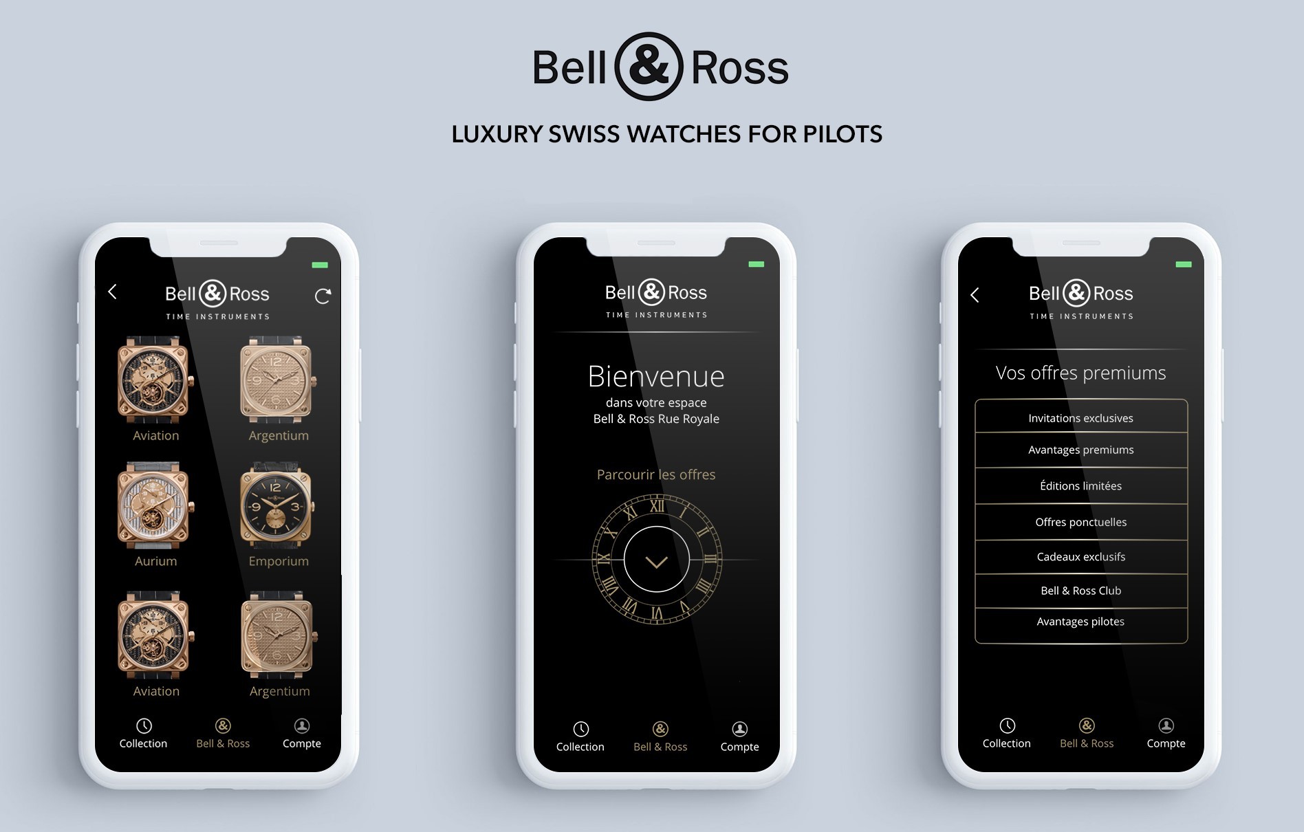
The core functionality of this application centers around beacon technology, with strategically placed sensors located beneath selected watches throughout the store. These beacons are configured to interact with the app, enabling it to deliver real-time information about each model as the customer approaches. As users navigate the store, the app identifies their proximity to specific watches and instantly presents detailed descriptions, design inspiration, technical specifications, and stories behind each model. This approach allows Bell & Ross to engage customers in an immersive experience, creating a blend of digital convenience and tactile luxury that sets a new standard in high-end retail environments.

<br>

To achieve a premium, seamless user experience, I oversaw the design and development of a refined interface that embodies the brand’s values of precision, elegance, and functionality. The app’s visual design mirrors the aesthetic of Bell & Ross watches, with clean lines, dark and sleek color palettes, and high-quality graphics that appeal to the brand’s discerning clientele. The navigation was crafted to be intuitive and fluid, allowing users to move effortlessly between various watch collections, each section offering an experience akin to paging through a luxury catalog. Every visual and functional element was meticulously tailored to convey the exclusivity and sophistication that Bell & Ross represents, ensuring a seamless transition between the digital and in-store environments.

<br>

Technologically, the beacon system presented both opportunities and challenges. To create a reliable and responsive interaction between the app and in-store beacons, I worked on developing a system that could process signals in real-time while filtering out unnecessary data to avoid overwhelming users. By implementing a precise signal mapping algorithm, we ensured that each beacon would only activate at optimal distances, providing timely and relevant information without intruding upon the shopping experience. To accommodate varying network conditions within store interiors, we incorporated offline capabilities, allowing the app to continue functioning even when connectivity is limited. These technical solutions were essential to maintaining a smooth, uninterrupted experience, particularly in the luxurious setting that Bell & Ross clientele expect.

<br>

In addition to enhancing the shopping experience, the app was designed to serve as an educational tool, offering insights into Bell & Ross’s commitment to quality and innovation. By tapping into the stories behind each watch, users gain an understanding of the brand’s dedication to aviation-inspired precision and the technical mastery involved in each piece. The app also includes interactive features that allow users to compare models, view high-resolution images of intricate watch mechanisms, and save their favorite selections. For customers interested in specific models, the app enables seamless access to information such as availability, customization options, and exclusive store offerings, further enhancing the sense of exclusivity and personalized service.


Bell & Ross is a renowned Swiss luxury watch brand, celebrated for its precision and elegance, with designs crafted specifically for aviation professionals, pilots, and aviation enthusiasts. Known for its heritage and expertise in the art of Swiss horology, the brand has established itself as a prestigious name in the luxury watch market. This project aimed to enhance the in-store experience for Bell & Ross customers by creating an interactive mobile application designed to function seamlessly within the brand’s flagship stores in Paris. The objective was to provide a sophisticated, high-tech experience that reflects the brand’s luxury identity while enriching the customer journey through intuitive navigation, guided information, and personalized insights.

<br>

The core functionality of this application centers around beacon technology, with strategically placed sensors located beneath selected watches throughout the store. These beacons are configured to interact with the app, enabling it to deliver real-time information about each model as the customer approaches. As users navigate the store, the app identifies their proximity to specific watches and instantly presents detailed descriptions, design inspiration, technical specifications, and stories behind each model. This approach allows Bell & Ross to engage customers in an immersive experience, creating a blend of digital convenience and tactile luxury that sets a new standard in high-end retail environments.

<br>

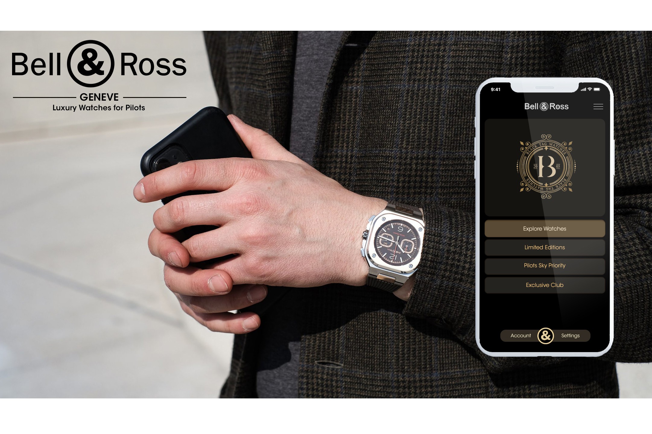
To achieve a premium, seamless user experience, I oversaw the design and development of a refined interface that embodies the brand’s values of precision, elegance, and functionality. The app’s visual design mirrors the aesthetic of Bell & Ross watches, with clean lines, dark and sleek color palettes, and high-quality graphics that appeal to the brand’s discerning clientele. The navigation was crafted to be intuitive and fluid, allowing users to move effortlessly between various watch collections, each section offering an experience akin to paging through a luxury catalog. Every visual and functional element was meticulously tailored to convey the exclusivity and sophistication that Bell & Ross represents, ensuring a seamless transition between the digital and in-store environments.
<br>

Technologically, the beacon system presented both opportunities and challenges. To create a reliable and responsive interaction between the app and in-store beacons, I worked on developing a system that could process signals in real-time while filtering out unnecessary data to avoid overwhelming users. By implementing a precise signal mapping algorithm, we ensured that each beacon would only activate at optimal distances, providing timely and relevant information without intruding upon the shopping experience. To accommodate varying network conditions within store interiors, we incorporated offline capabilities, allowing the app to continue functioning even when connectivity is limited. These technical solutions were essential to maintaining a smooth, uninterrupted experience, particularly in the luxurious setting that Bell & Ross clientele expect.

<br>

In addition to enhancing the shopping experience, the app was designed to serve as an educational tool, offering insights into Bell & Ross’s commitment to quality and innovation. By tapping into the stories behind each watch, users gain an understanding of the brand’s dedication to aviation-inspired precision and the technical mastery involved in each piece. The app also includes interactive features that allow users to compare models, view high-resolution images of intricate watch mechanisms, and save their favorite selections. For customers interested in specific models, the app enables seamless access to information such as availability, customization options, and exclusive store offerings, further enhancing the sense of exclusivity and personalized service.


Bell & Ross is a renowned Swiss luxury watch brand, celebrated for its precision and elegance, with designs crafted specifically for aviation professionals, pilots, and aviation enthusiasts. Known for its heritage and expertise in the art of Swiss horology, the brand has established itself as a prestigious name in the luxury watch market. This project aimed to enhance the in-store experience for Bell & Ross customers by creating an interactive mobile application designed to function seamlessly within the brand’s flagship stores in Paris. The objective was to provide a sophisticated, high-tech experience that reflects the brand’s luxury identity while enriching the customer journey through intuitive navigation, guided information, and personalized insights.

<br>

The core functionality of this application centers around beacon technology, with strategically placed sensors located beneath selected watches throughout the store. These beacons are configured to interact with the app, enabling it to deliver real-time information about each model as the customer approaches. As users navigate the store, the app identifies their proximity to specific watches and instantly presents detailed descriptions, design inspiration, technical specifications, and stories behind each model. This approach allows Bell & Ross to engage customers in an immersive experience, creating a blend of digital convenience and tactile luxury that sets a new standard in high-end retail environments.

<br>

To achieve a premium, seamless user experience, I oversaw the design and development of a refined interface that embodies the brand’s values of precision, elegance, and functionality. The app’s visual design mirrors the aesthetic of Bell & Ross watches, with clean lines, dark and sleek color palettes, and high-quality graphics that appeal to the brand’s discerning clientele. The navigation was crafted to be intuitive and fluid, allowing users to move effortlessly between various watch collections, each section offering an experience akin to paging through a luxury catalog. Every visual and functional element was meticulously tailored to convey the exclusivity and sophistication that Bell & Ross represents, ensuring a seamless transition between the digital and in-store environments.

<br>

Technologically, the beacon system presented both opportunities and challenges. To create a reliable and responsive interaction between the app and in-store beacons, I worked on developing a system that could process signals in real-time while filtering out unnecessary data to avoid overwhelming users. By implementing a precise signal mapping algorithm, we ensured that each beacon would only activate at optimal distances, providing timely and relevant information without intruding upon the shopping experience. To accommodate varying network conditions within store interiors, we incorporated offline capabilities, allowing the app to continue functioning even when connectivity is limited. These technical solutions were essential to maintaining a smooth, uninterrupted experience, particularly in the luxurious setting that Bell & Ross clientele expect.

<br>

In addition to enhancing the shopping experience, the app was designed to serve as an educational tool, offering insights into Bell & Ross’s commitment to quality and innovation. By tapping into the stories behind each watch, users gain an understanding of the brand’s dedication to aviation-inspired precision and the technical mastery involved in each piece. The app also includes interactive features that allow users to compare models, view high-resolution images of intricate watch mechanisms, and save their favorite selections. For customers interested in specific models, the app enables seamless access to information such as availability, customization options, and exclusive store offerings, further enhancing the sense of exclusivity and personalized service.


Bell & Ross is a renowned Swiss luxury watch brand, celebrated for its precision and elegance, with designs crafted specifically for aviation professionals, pilots, and aviation enthusiasts. Known for its heritage and expertise in the art of Swiss horology, the brand has established itself as a prestigious name in the luxury watch market. This project aimed to enhance the in-store experience for Bell & Ross customers by creating an interactive mobile application designed to function seamlessly within the brand’s flagship stores in Paris. The objective was to provide a sophisticated, high-tech experience that reflects the brand’s luxury identity while enriching the customer journey through intuitive navigation, guided information, and personalized insights.

<br>

The core functionality of this application centers around beacon technology, with strategically placed sensors located beneath selected watches throughout the store. These beacons are configured to interact with the app, enabling it to deliver real-time information about each model as the customer approaches. As users navigate the store, the app identifies their proximity to specific watches and instantly presents detailed descriptions, design inspiration, technical specifications, and stories behind each model. This approach allows Bell & Ross to engage customers in an immersive experience, creating a blend of digital convenience and tactile luxury that sets a new standard in high-end retail environments.

<br>

To achieve a premium, seamless user experience, I oversaw the design and development of a refined interface that embodies the brand’s values of precision, elegance, and functionality. The app’s visual design mirrors the aesthetic of Bell & Ross watches, with clean lines, dark and sleek color palettes, and high-quality graphics that appeal to the brand’s discerning clientele. The navigation was crafted to be intuitive and fluid, allowing users to move effortlessly between various watch collections, each section offering an experience akin to paging through a luxury catalog. Every visual and functional element was meticulously tailored to convey the exclusivity and sophistication that Bell & Ross represents, ensuring a seamless transition between the digital and in-store environments.

<br>

Technologically, the beacon system presented both opportunities and challenges. To create a reliable and responsive interaction between the app and in-store beacons, I worked on developing a system that could process signals in real-time while filtering out unnecessary data to avoid overwhelming users. By implementing a precise signal mapping algorithm, we ensured that each beacon would only activate at optimal distances, providing timely and relevant information without intruding upon the shopping experience. To accommodate varying network conditions within store interiors, we incorporated offline capabilities, allowing the app to continue functioning even when connectivity is limited. These technical solutions were essential to maintaining a smooth, uninterrupted experience, particularly in the luxurious setting that Bell & Ross clientele expect.

<br>

In addition to enhancing the shopping experience, the app was designed to serve as an educational tool, offering insights into Bell & Ross’s commitment to quality and innovation. By tapping into the stories behind each watch, users gain an understanding of the brand’s dedication to aviation-inspired precision and the technical mastery involved in each piece. The app also includes interactive features that allow users to compare models, view high-resolution images of intricate watch mechanisms, and save their favorite selections. For customers interested in specific models, the app enables seamless access to information such as availability, customization options, and exclusive store offerings, further enhancing the sense of exclusivity and personalized service.


Another challenge of this project was to ensure that the app’s functionality aligned with Bell & Ross’s premium brand image. Catering to a wealthy and discerning clientele, the app needed to reflect the same elegance and attention to detail as the watches themselves. To this end, we incorporated a personalized concierge feature that allows users to request assistance, book appointments, or inquire about particular models directly from their device. This feature not only reinforces the brand’s high standard of customer service but also adds an element of exclusivity, allowing customers to enjoy a tailor-made shopping experience.

<br>

Given that the app operates in an environment of luxury retail, I also focused on security and data privacy to ensure that all interactions remain private and secure. Users’ personal preferences, browsing history, and watch selections are stored locally, with optional encrypted backups, ensuring that client information is handled discreetly. These precautions are crucial in a high-end retail setting, where customer trust is paramount. By implementing advanced encryption protocols and providing users with clear data privacy options, we enhanced the app’s appeal to privacy-conscious clients who value discretion.

<br>

To complement the app’s technical sophistication, we implemented a strategic digital marketing campaign targeting the brand’s elite clientele. The campaign involved exclusive preview events, where select clients were invited to experience the app in-store before its official launch. Additionally, we collaborated with luxury lifestyle influencers and high-end publications to generate buzz within the target demographic, positioning the app as a must-have for aficionados of fine watchmaking. This campaign was successful in creating anticipation around the app, enhancing Bell & Ross’s image as a brand that combines tradition with innovation.

<br>

Ultimately, the Bell & Ross project was about delivering a cutting-edge digital solution that respects the heritage and quality associated with Swiss luxury watchmaking while enhancing the customer journey in an interactive, engaging way. By blending sophisticated technology with a personalized, luxurious in-store experience, this project not only elevated the Bell & Ross shopping experience but also reinforced the brand’s position as a leader in luxury and innovation.